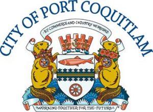
The City of Port Coquitlam’s official symbols are the corporate logo and coat of arms.
Adopted by the City in 2003, the City of Port Coquitlam’s corporate logo expresses the unique nature of this healthy, vibrant and caring community and is used to represent the City brand in all of its publications.

The logo’s distinctive feature is a stylized leaf symbol that represents the ‘O’ in the word PORT. The leaf symbol distinguishes the city’s strengths and assets in the following ways:
- Representing the City’s people, the leaf’s stem suggests a figure with arms reaching upwards in celebration and victory. The outside edges of the leaf provide shelter and protection to the figure within. This symbolizes our strong sense of Port Coquitlam as a community in which people live and grow safely.
- The leaf as a whole represents Port Coquitlam’s unique geographical features and the high value placed on its natural assets. The stem represents the three rivers that border the city. The outside portion represents the Traboulay PoCo Trail that encircles our city. The logo pays homage to the physicality of the land. It states clearly; that these attributes are important to who we are and that we understand our responsibility as stewards of the environment.
Completed in 1987, the City of Port Coquitlam’s Coat of Arms replaced the previous emblem, which dated back to the City’s incorporation on March 7, 1913. It bears the original motto, “By Commerce and Industry We Prosper”, which was an obvious choice for an expansionist and visionary community.

The shield blends the themes of native and natural heritage and the railway. The central band or heraldic fess features a special edge implying a conifer twig, originally developed by a Finnish heraldic artist. The fess represents a pathway, with the edge suggesting the City’s green spaces and the continuing wealth and amenities flowing from local forests. The railway is highlighted through the red steam locomotive wheel and the twin bands of gold, the colour of commerce. The shield’s upper area celebrates the Coquitlam River from which the City takes its name. Coquitlam is a First Nations word meaning “little red fish.”
The crest is set on a wreath of two of the City’s official heraldic colours, white and green. It is composed of a mural coronet, an emblem for municipal government. The coronet is set with six anchors, three visible, which represent ships and maritime commerce and refer to the Port in the City’s name.
The supporters stand on a compartment representing the grass of the City lands. The beaver supporters, coloured in the gold of commerce to echo the motto, are taken directly from the old emblem on City Hall. They have patriotic and thematic meaning. In addition to being Canada’s national animal and a symbol of industry, the beavers play an important role in the City’s own heritage of symbols. The collar on the left hand supporter alludes to the Royal Crown in the old emblem. The other collar features the City’s floral emblem, the azalea. A Salish spindle whorl, honouring the Sto:lo People, hangs from each collar. The whorl is carved with a representation of a silver salmon. The City’s original motto is preserved on a scroll above.
Request for City Logo Use
The artwork, symbols and typographical content on this page are owned by the City of Port Coquitlam. Any duplication in whole or in part is an infringement of the copyright, trademark and/or design rights of the City of Port Coquitlam and is prohibited by law.
To request permission to use the City’s corporate logo or to seek clarification on the City's graphic standards, please complete the form below.
